
UNIVERSITY
OF MELBOURNE
BRAND CONCEPTS
Giving fresh life to a established, world class brand...
The University of Melbourne is one of the oldest and most prestigious of Australian universities. Research shows that its brand, its reputation, is the primary reason that prospective students, staff and collaborators choose the University of Melbourne. Unfortunately, the application of the University's brand, particularly its visual identity, was not living up to its reputation.
Hive Creative was engaged to address this issue. During the design process, we developed several aesthetic directions which we felt suited the requirements of the brand in different ways.
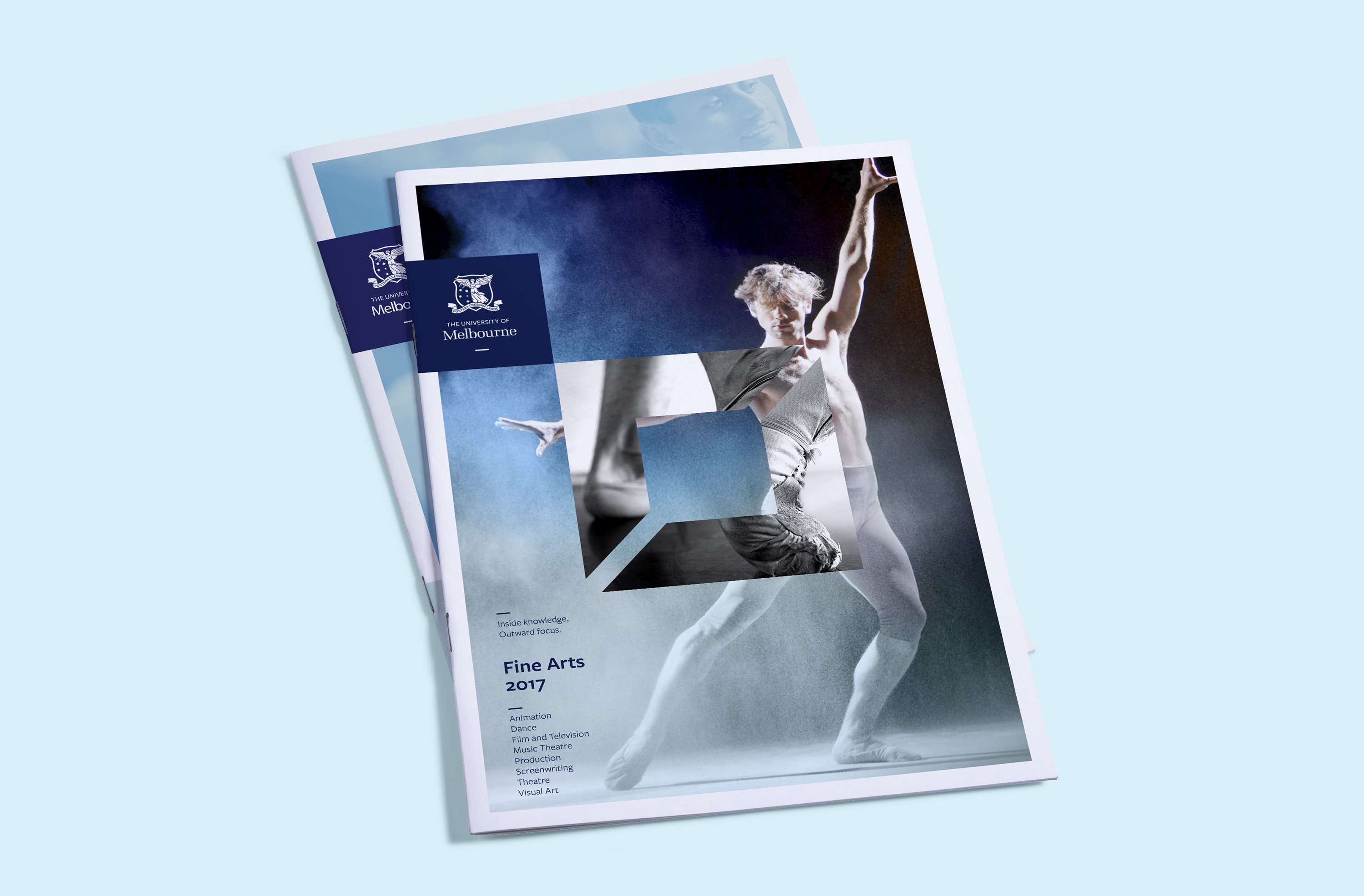
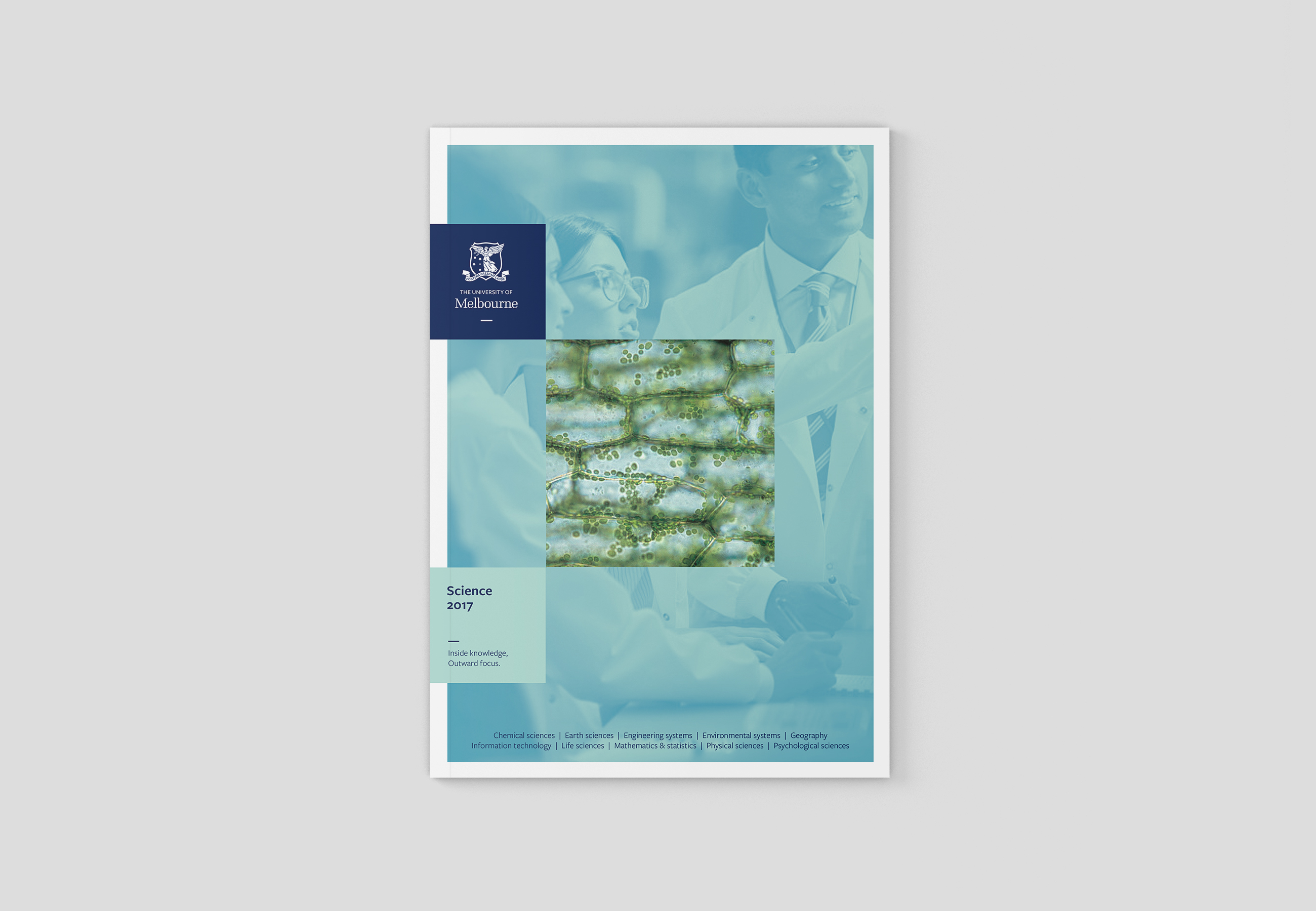
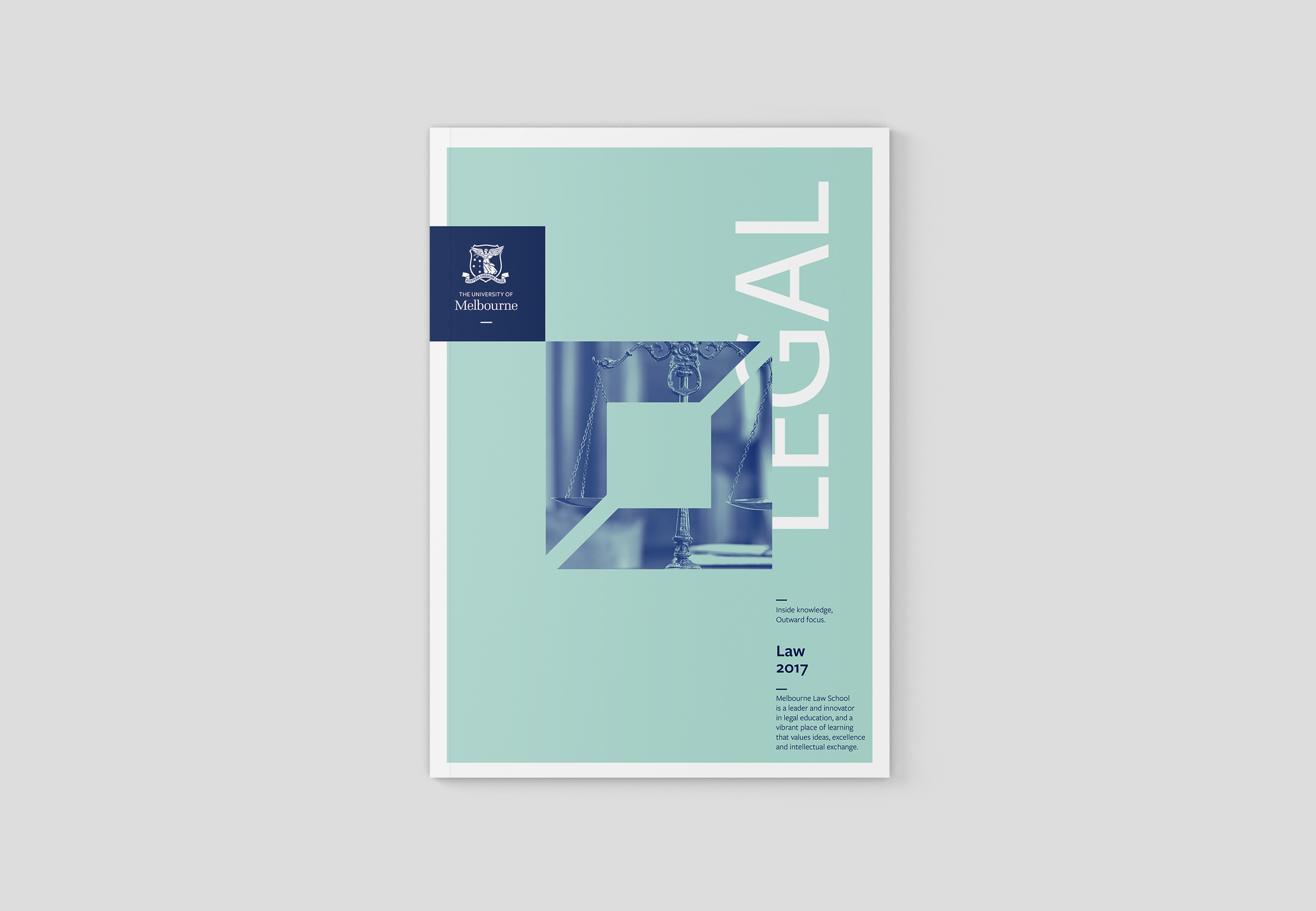
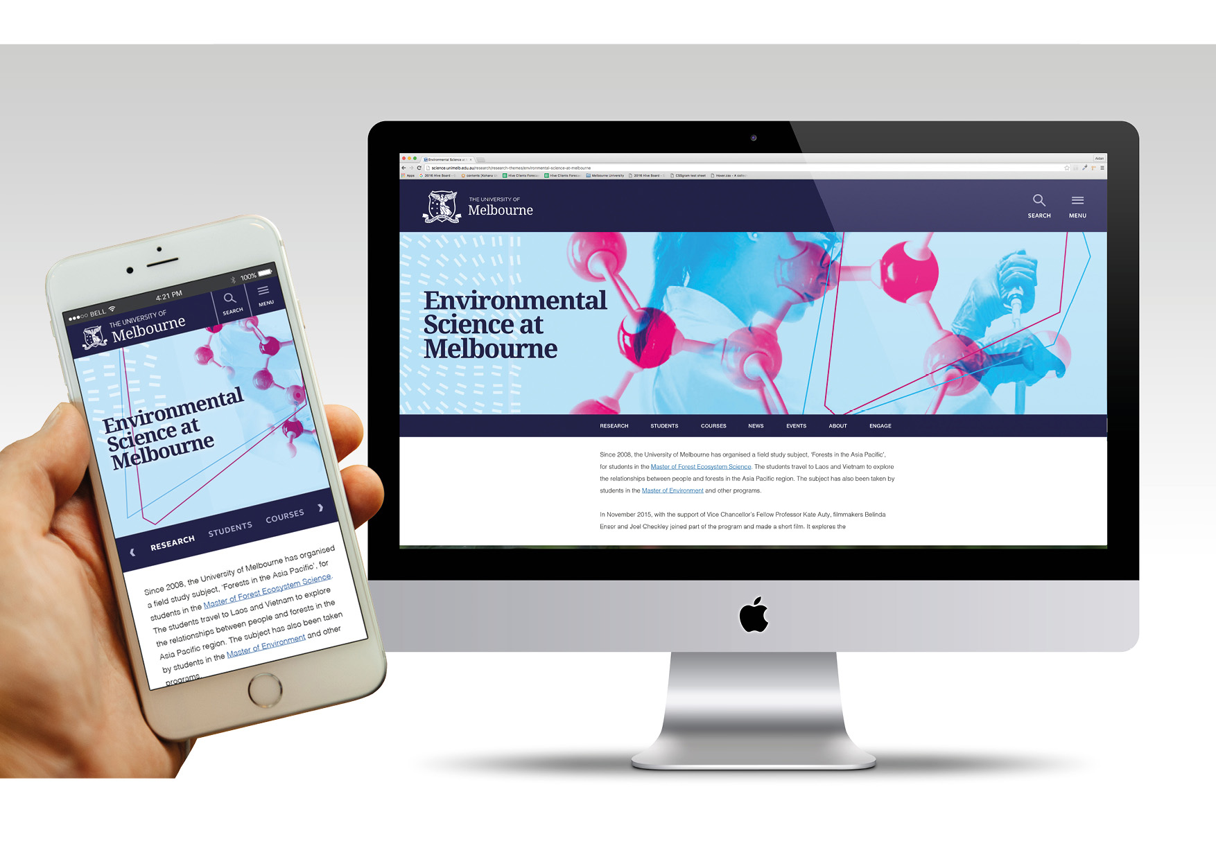
Direction 1: Foundation
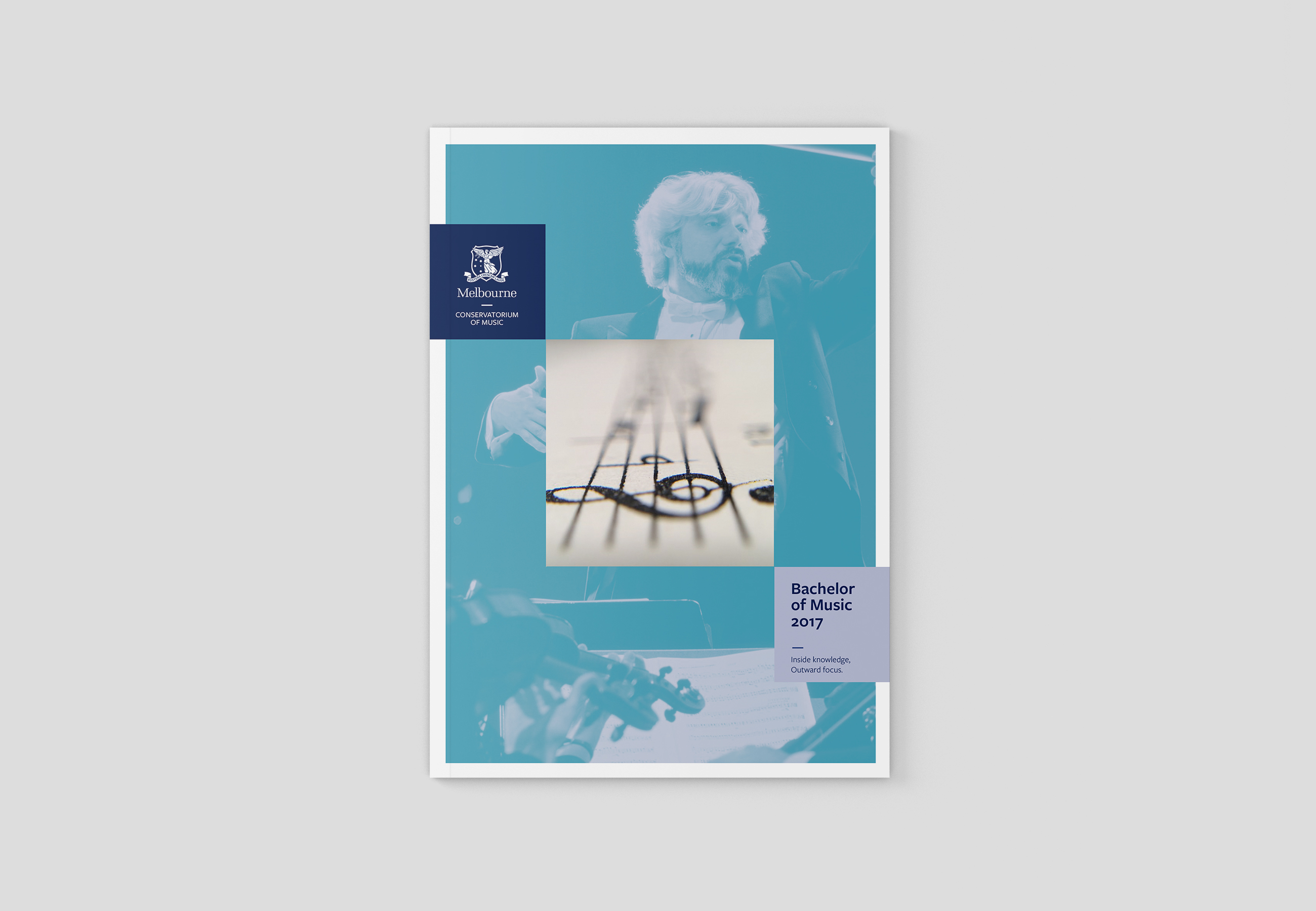
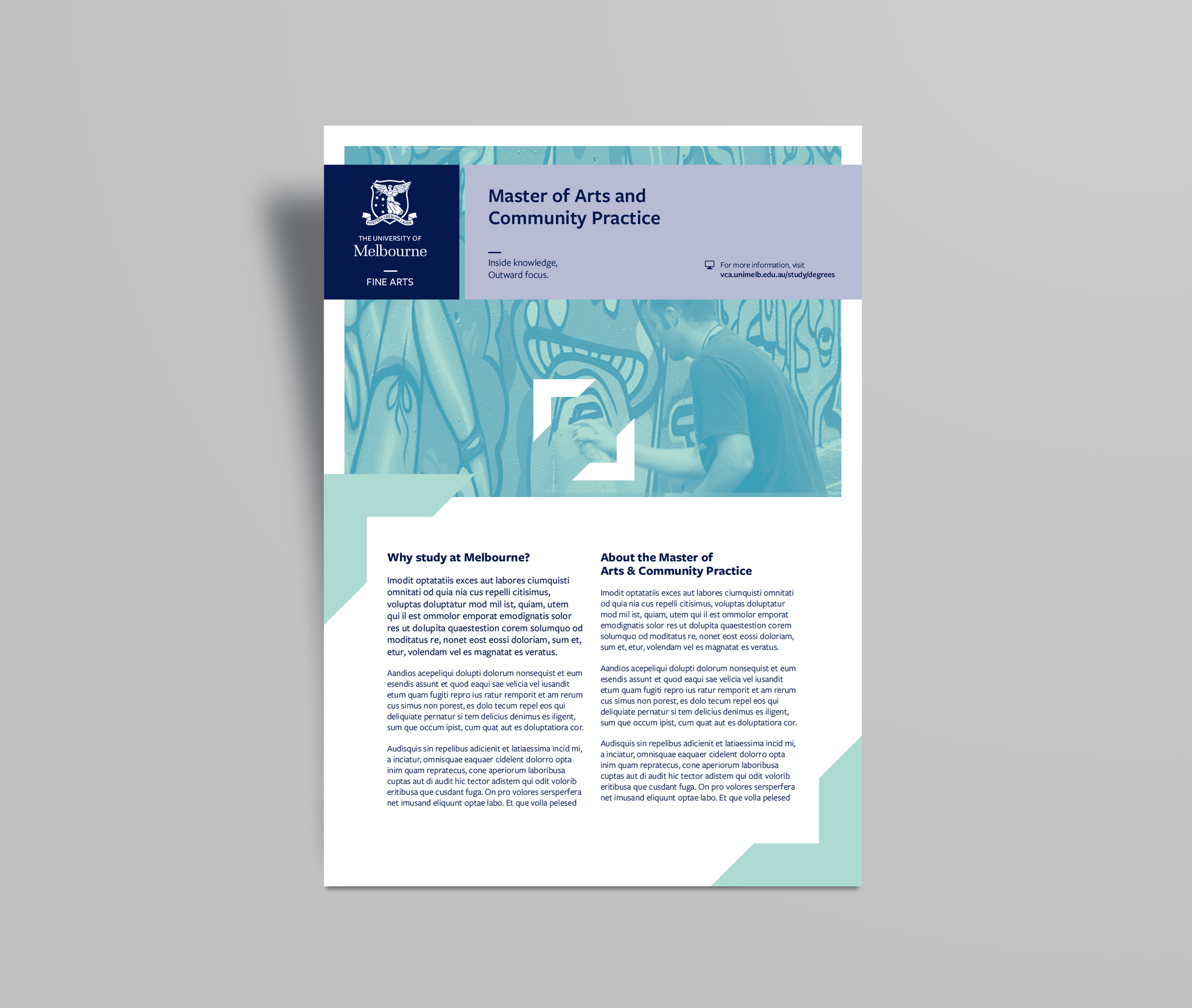
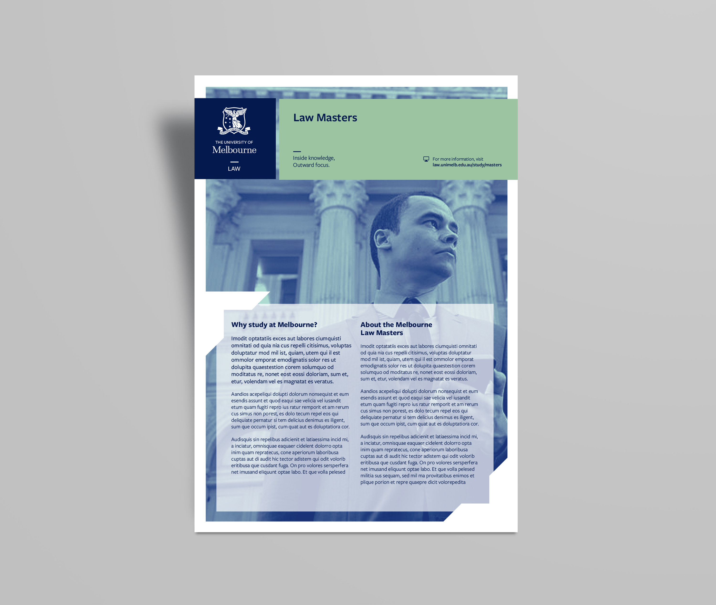
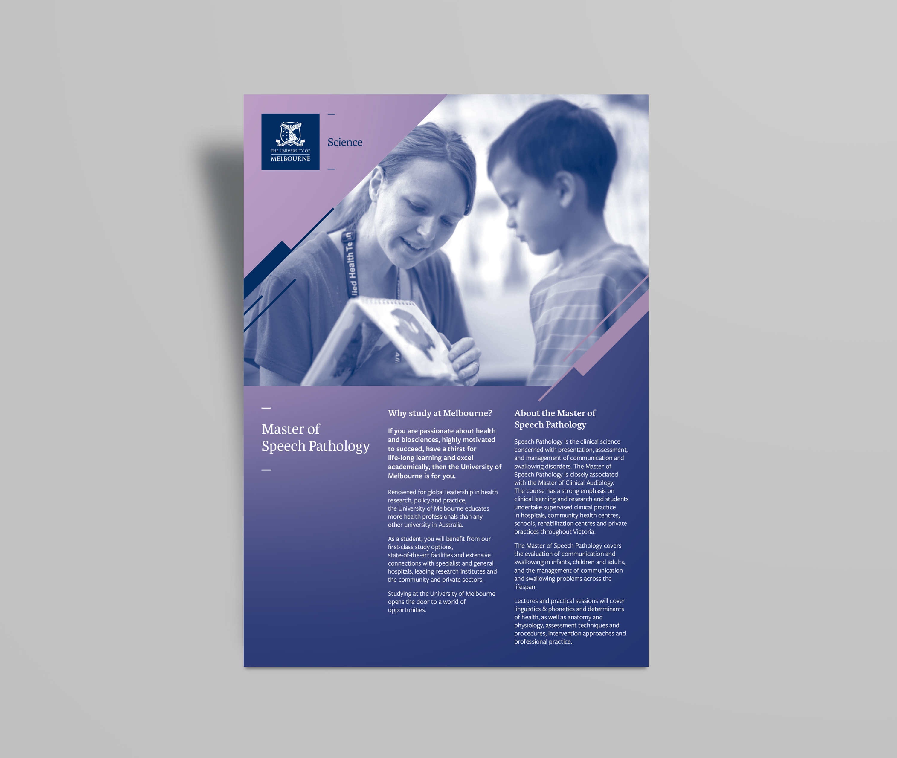
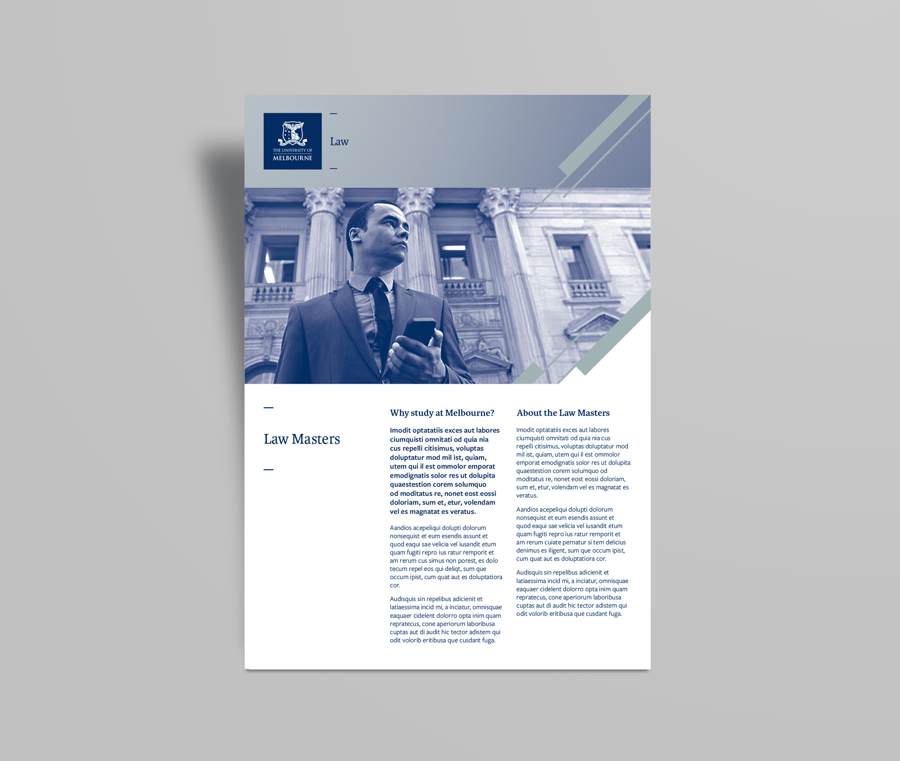
This direction was all about the reputation that the University of Melbourne has built over the years as a cornerstone of the community. Taking the basic unit of a square, a solid, stable unit that is also flexible, with unlimited possibilities for development, we constructed a system that is also consistent, yet flexible. The square and the layout structure provides a foundation for multiple flexible outcomes and acts as a window into different fews of the same subject. This use of dual imagery - close ups, and wider views is a metaphor for the breadth of education offered at the University of Melbourne: Intimate knowledge of a subject, with a broader outward focus to the wider community.
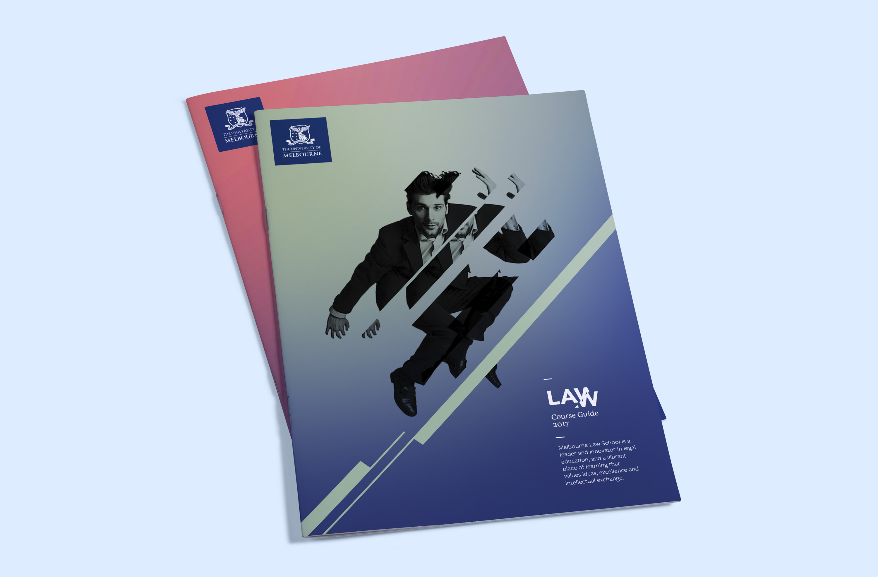
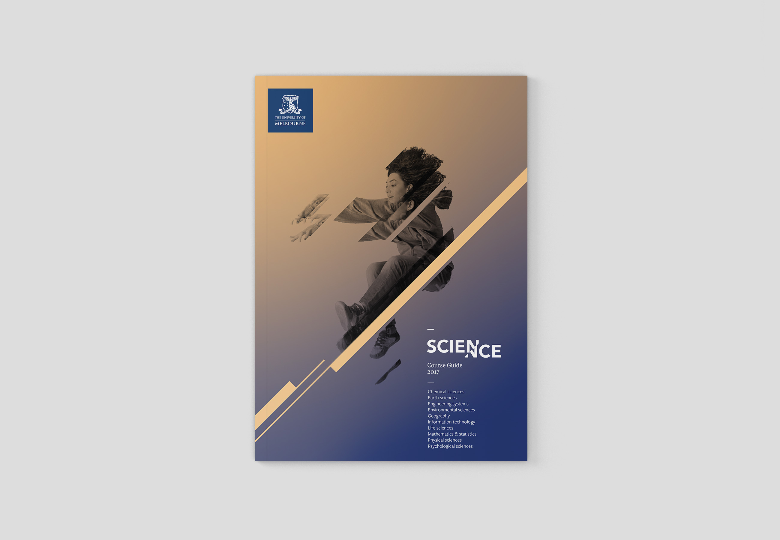
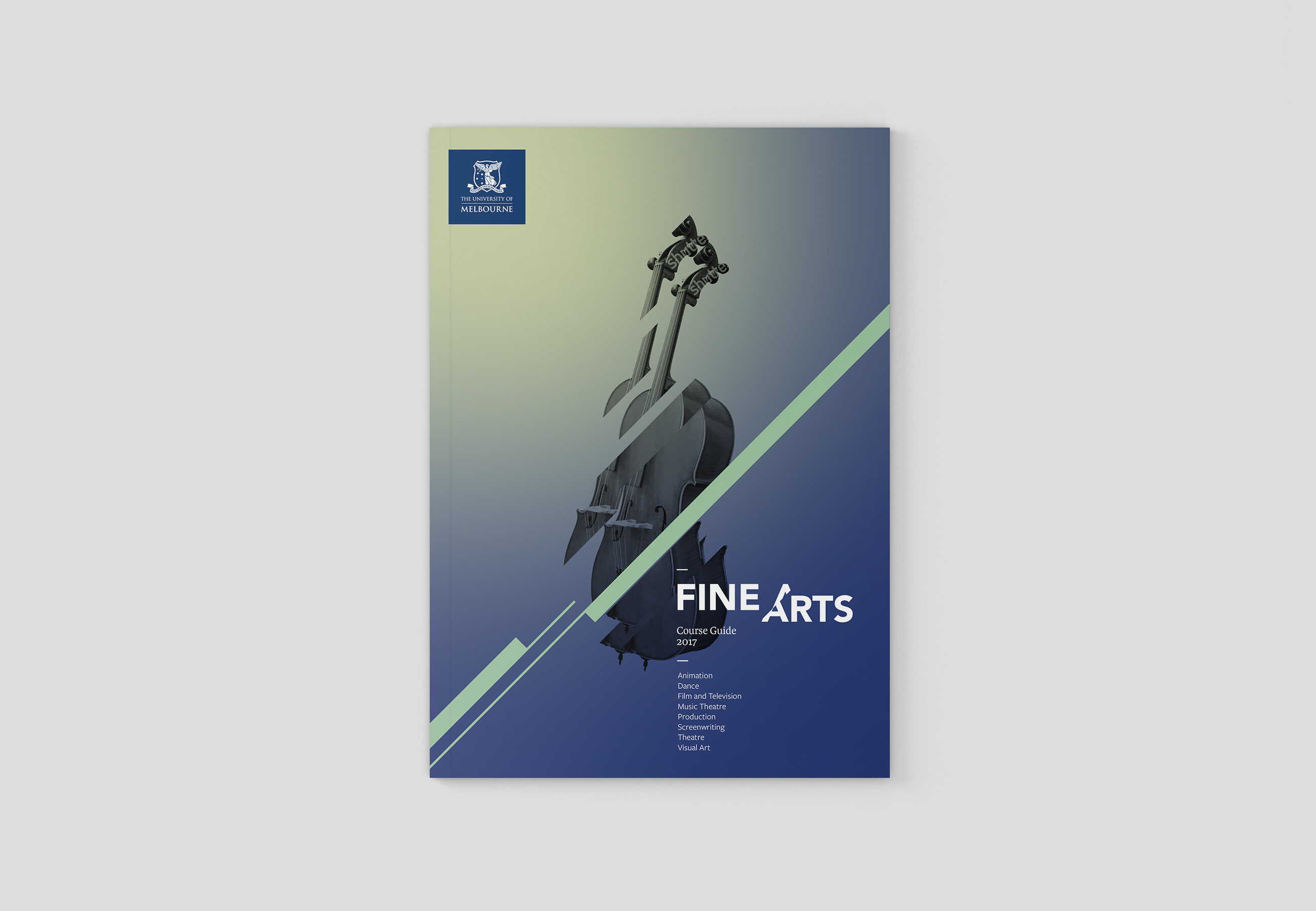
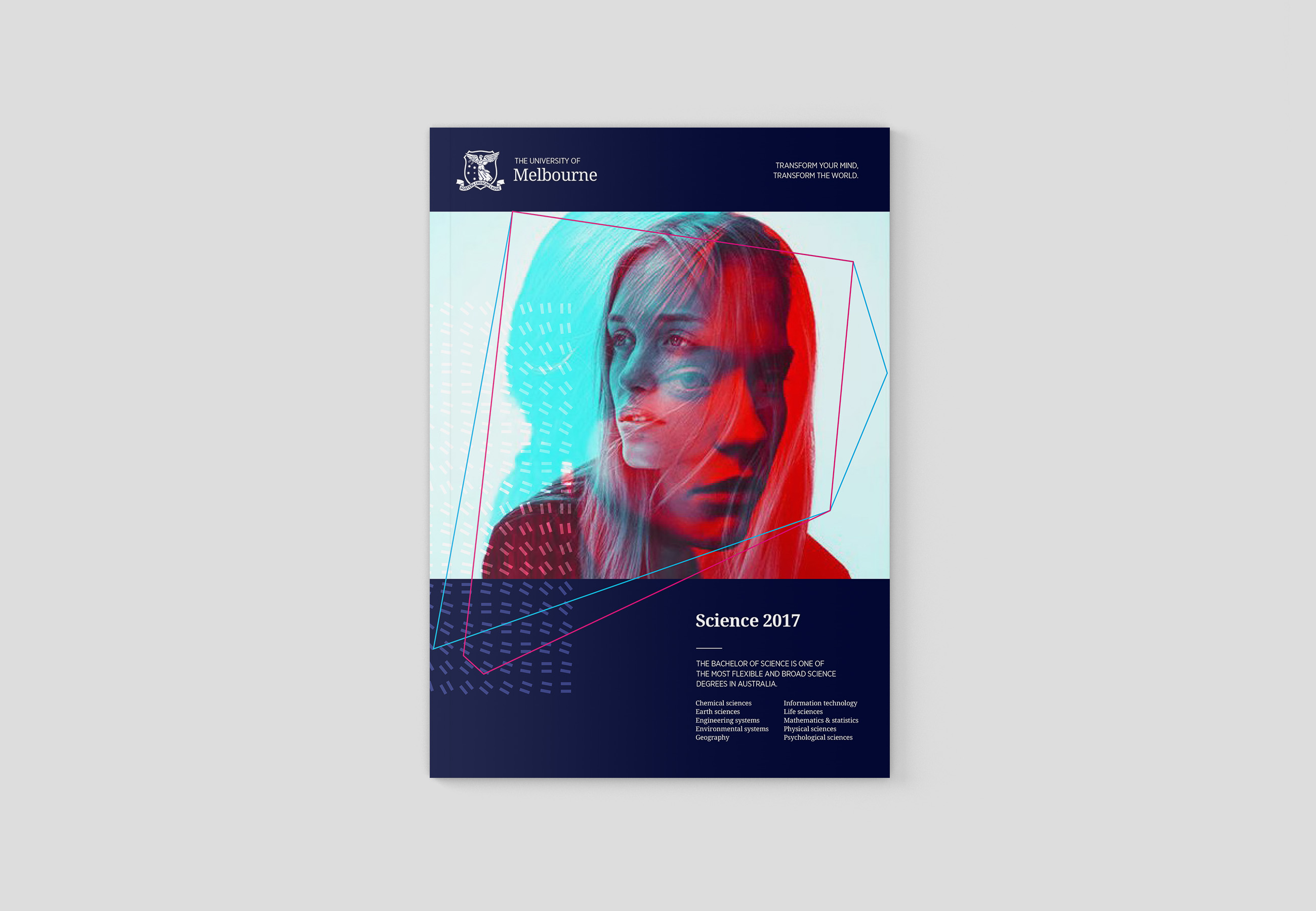
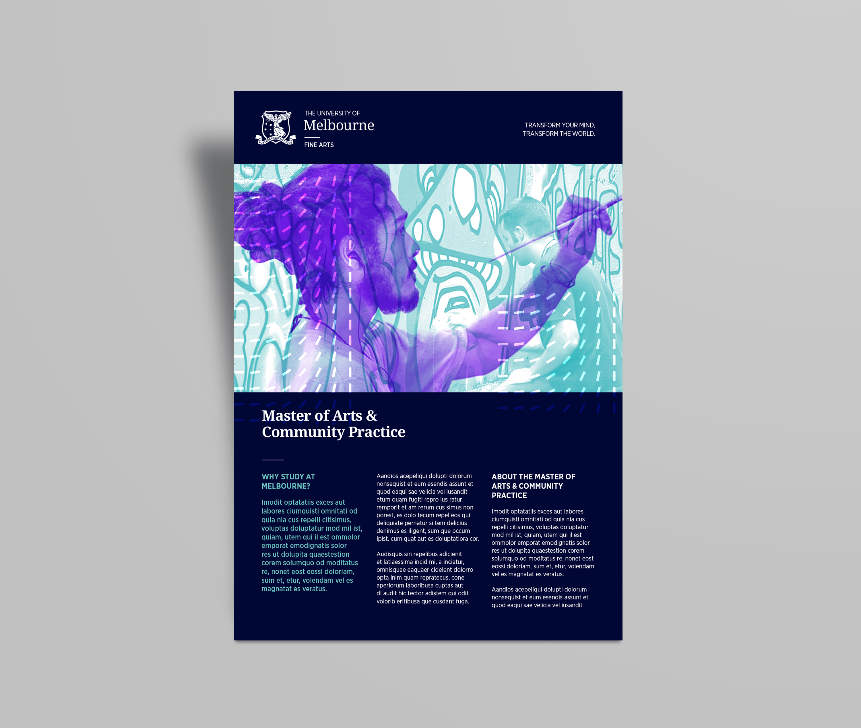
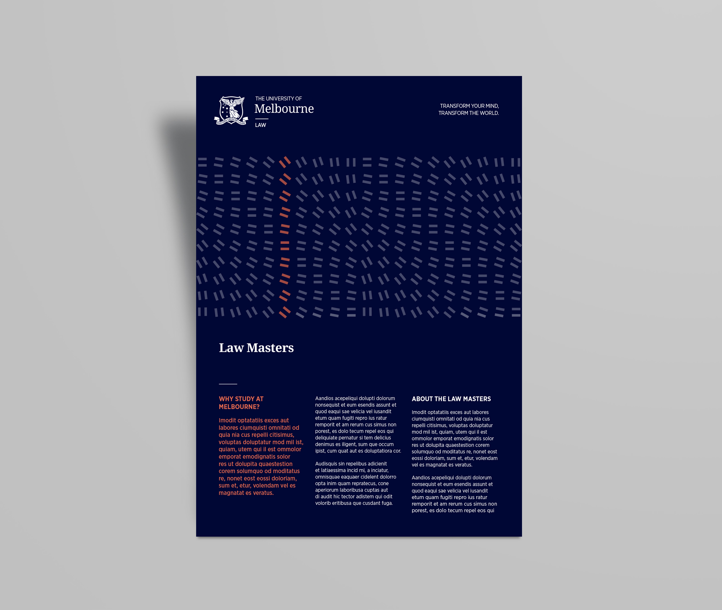
Direction 2: Momentum
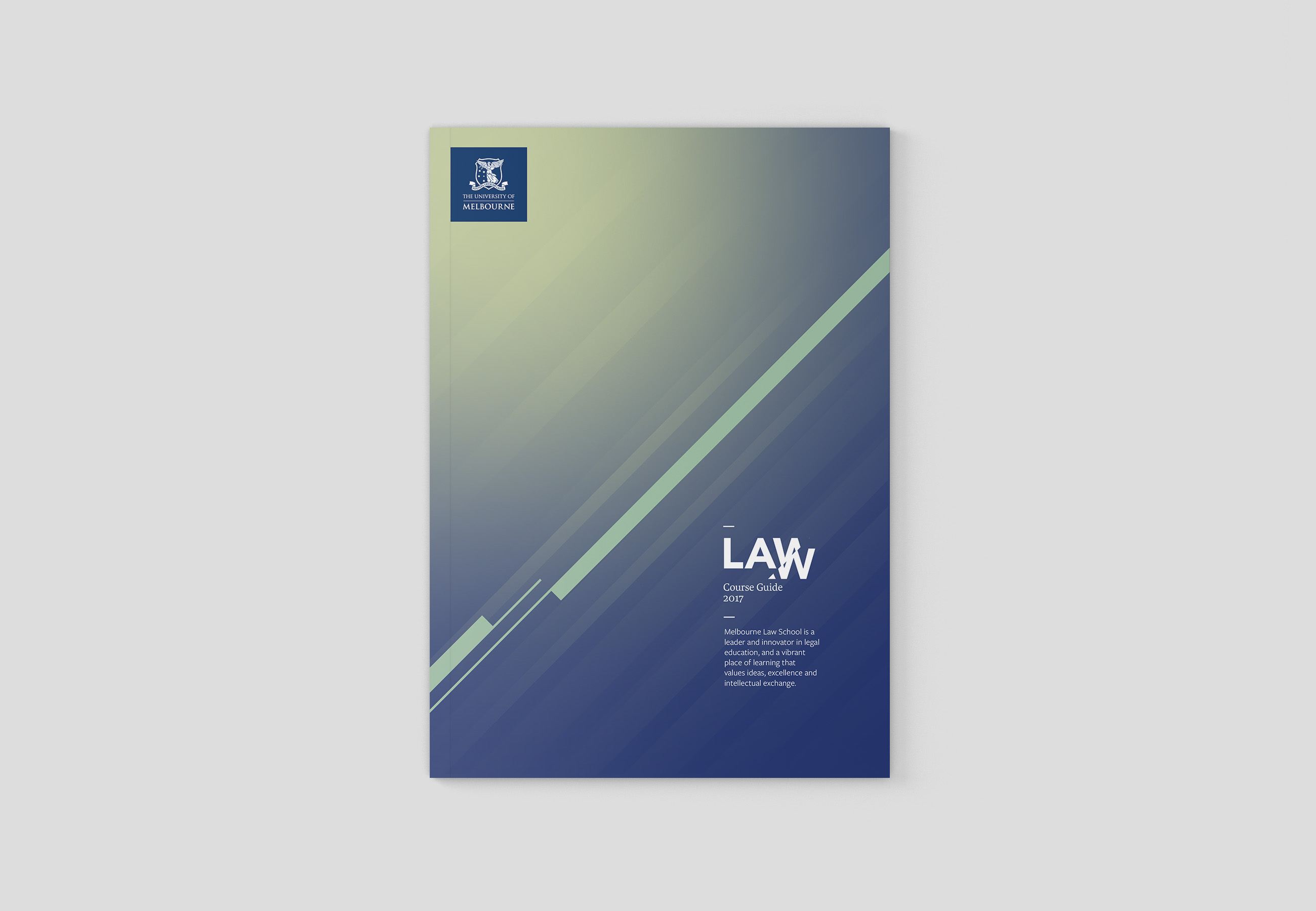
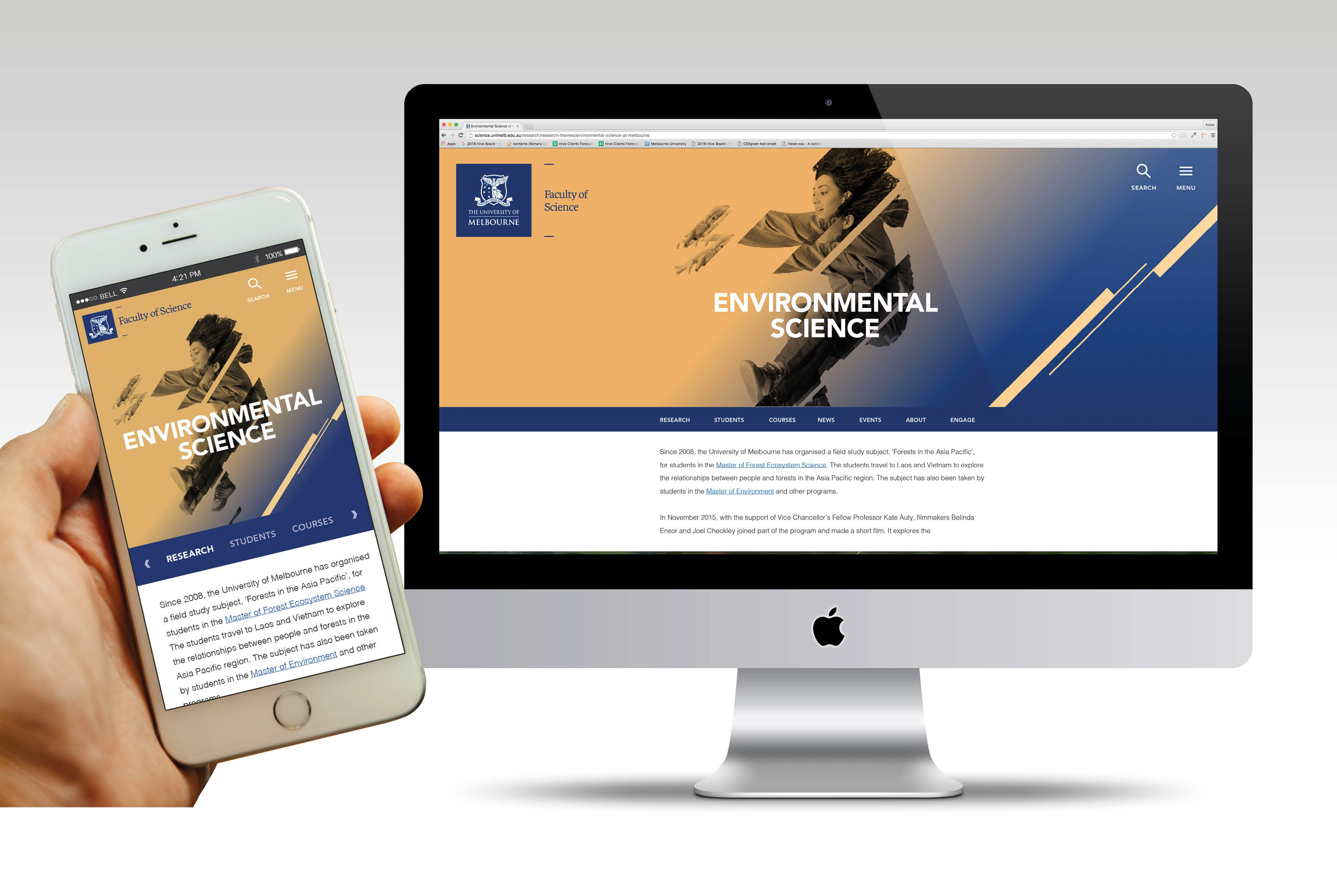
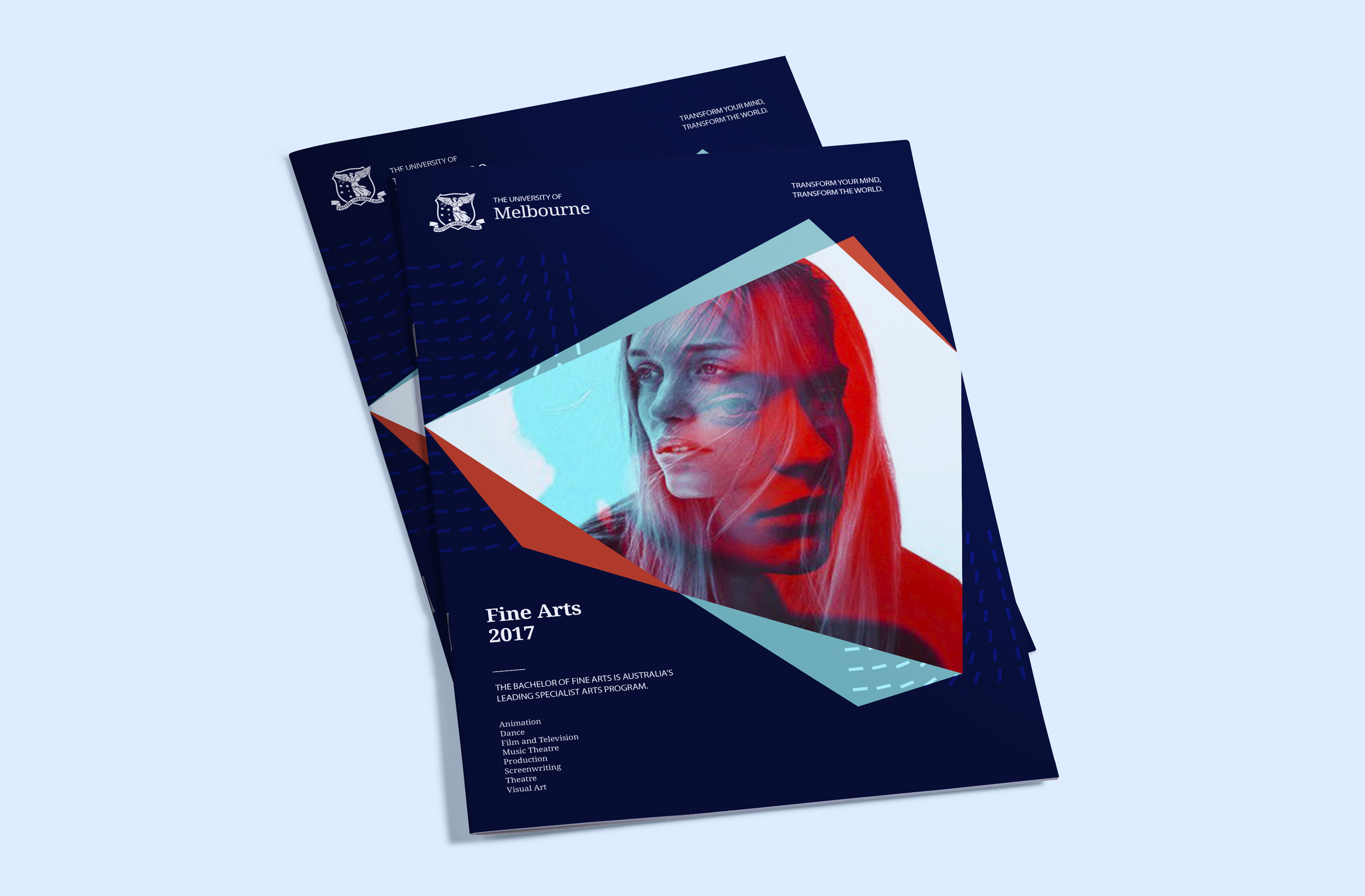
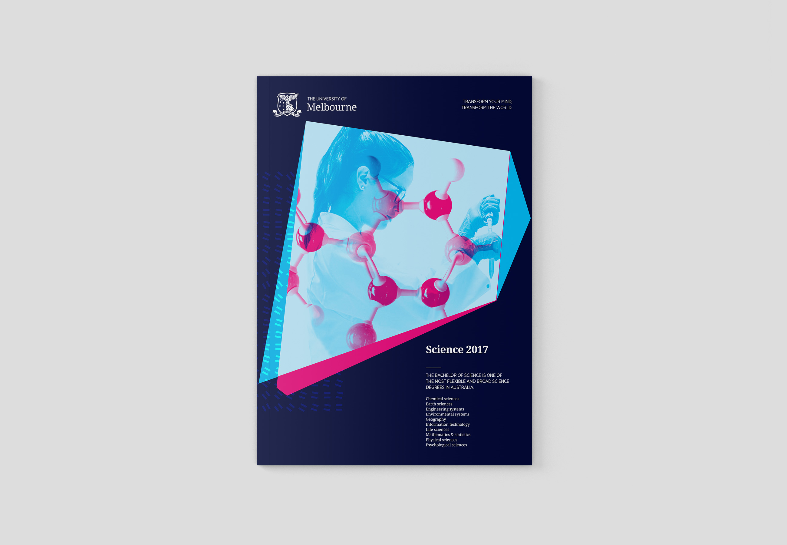
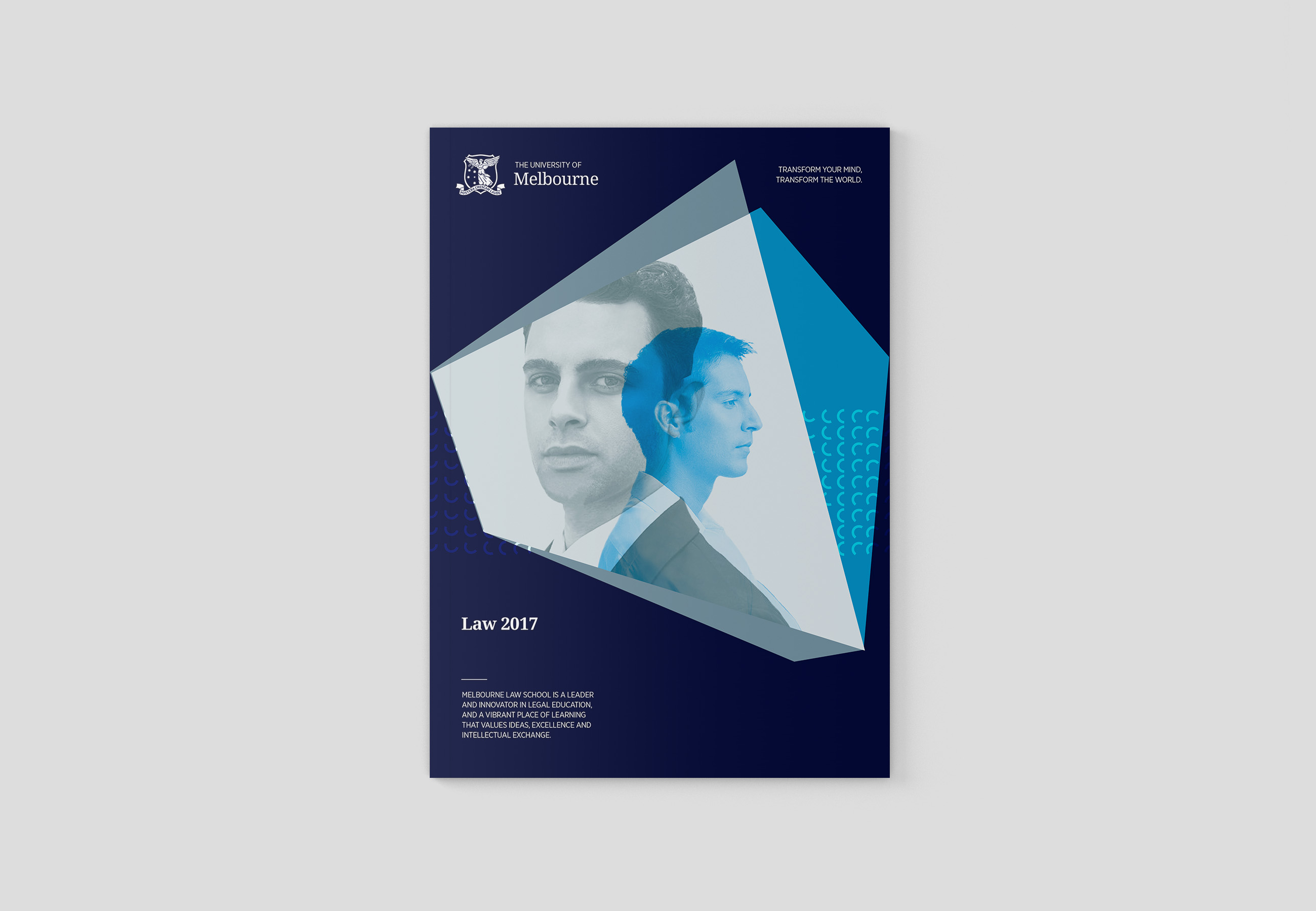
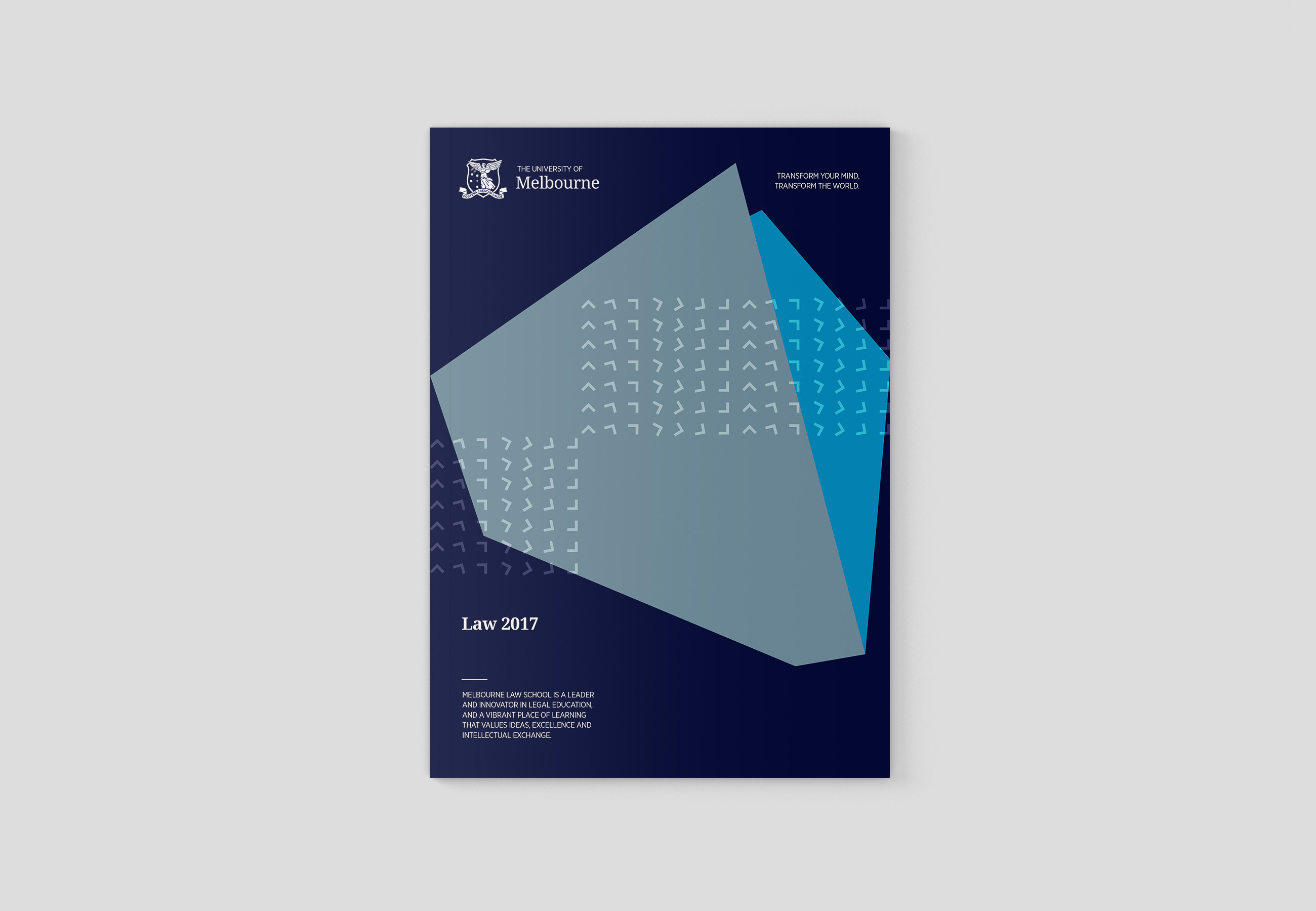
Learning is a journey, it is an activity of progression, of moment, of momentum. This design direction visualises this with high energy photographic style and a vivid colour palette, capturing the vitality of pursuit of achievement that is essential to the University of Melbourne. Again, this system is flexible and can be applied to a variety of subject matter and imagery - a consistent 45 degree angle forms a graphic signature which is repeatable and recognisable across applications.
Direction 3: Transformation
“This is a place where great scholars lead talented students to open their minds, share wisdom and face the great unknowns: a place where each new generation can define a future that it values.” – University of Melbourne
This direction is built on the themes of expansion and metamorphosis, taking the idea that university is a place where people come to grow and develop, to expand their knowledge and their minds, to fulfil their potential and become the best and brightest version of whatever it is they are to become.
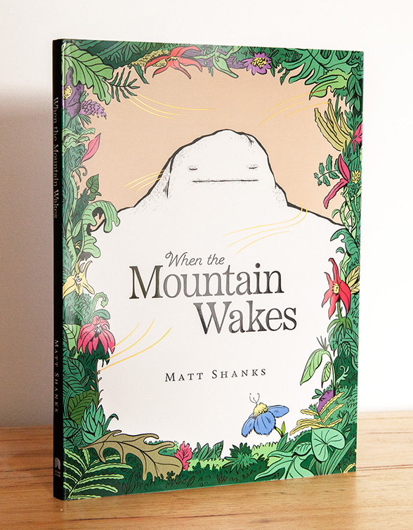
When the Mountain Wakes
Cover design for children's picture book, published by Affirm Press

My Sister, the Todzilla
Book design for children's picture book, published by Affirm Press
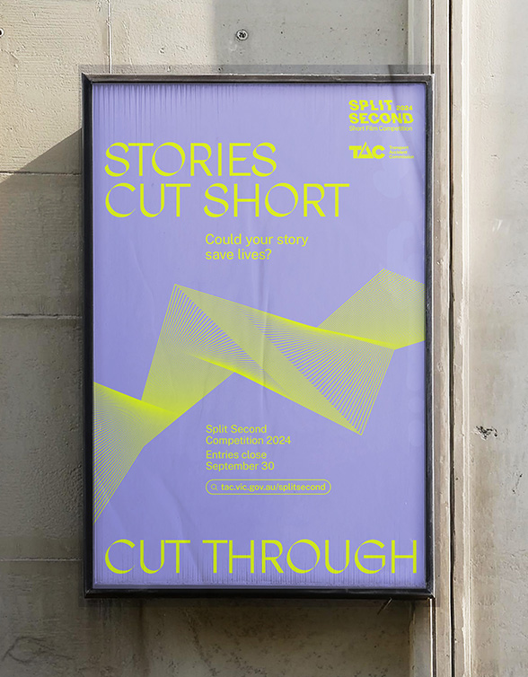
Split Second
Campaign identity concept for TAC
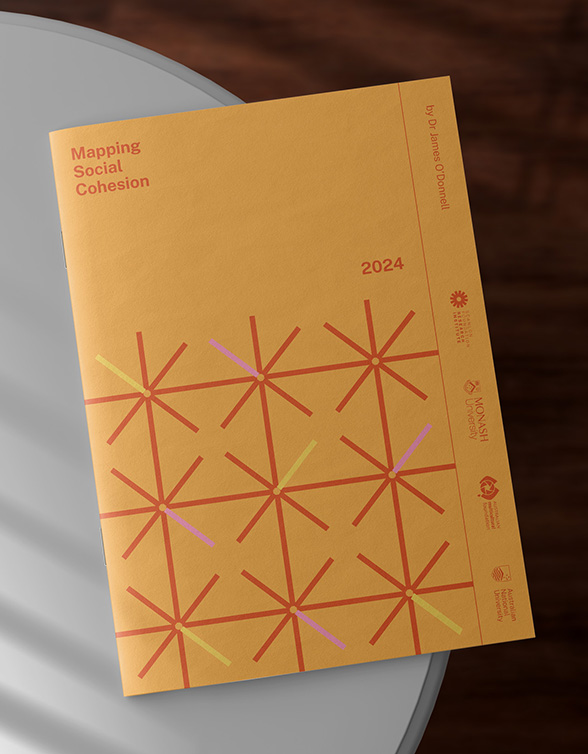
Mapping Social Cohesion 2024
Publication design and visual identity for the Scanlon Foundation Research Institute's annual research report
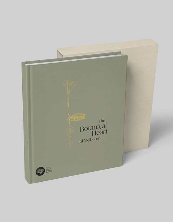
Royal Botanic Gardens
Book design concepts for Melbourne's Royal Botanic Gardens.
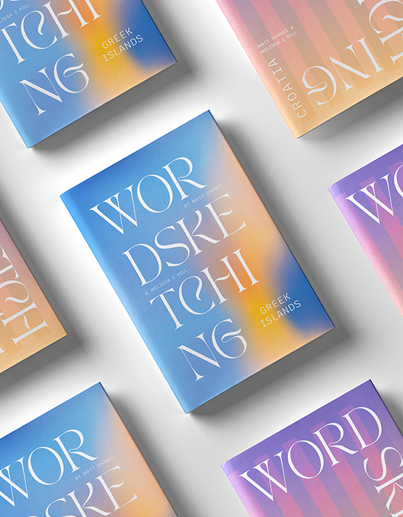
Word Sketching
Book design for my personal travel musings.
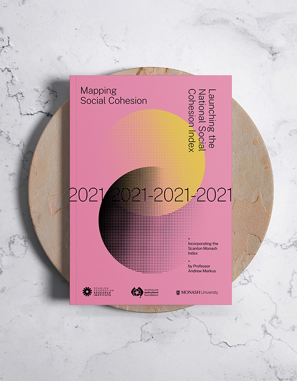
Mapping Social Cohesion 2021
Publication design and visual identity for the Scanlon Foundation Research Institute's annual research report
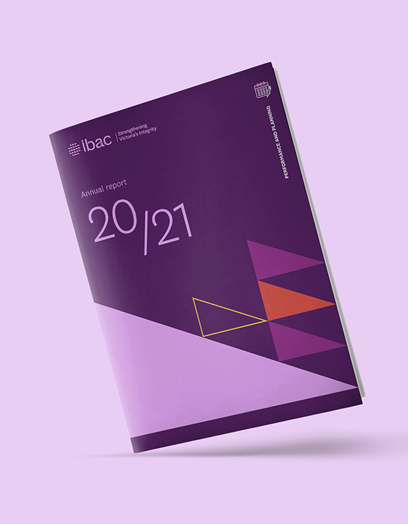
IBAC
Visual identity refresh for Victoria's Independent Broadbased Anti-corruption Commission (IBAC)