
MARKO
VISUAL
IDENTITY
Fresh food from the ground up...
Marko is a new plant-based and sustainability focused diner in South Melbourne, serving up local, all-natural food. Think HQ was tasked with building a unique brand identity for Marko and establishing a presence across both social and traditional media.
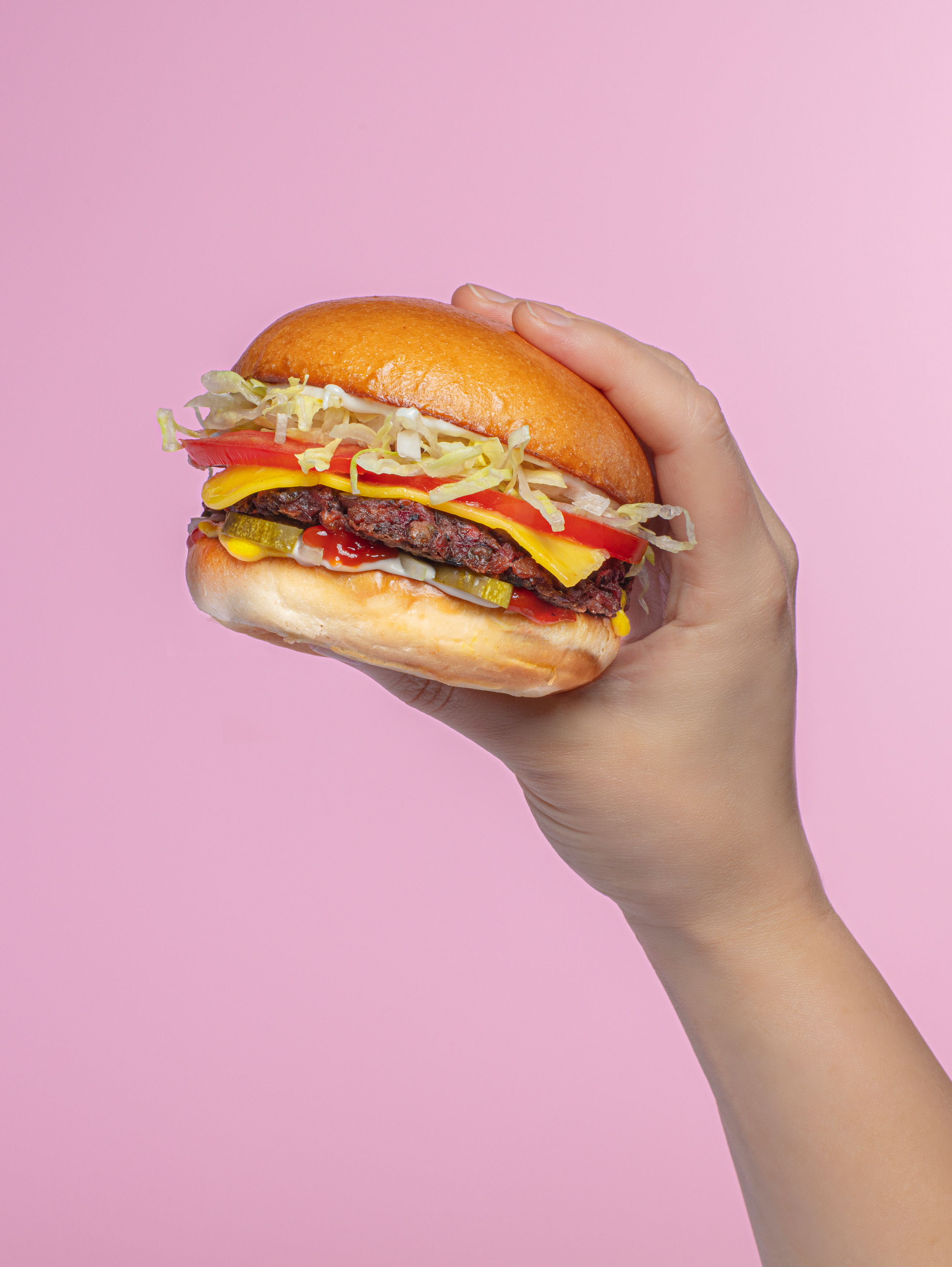
The brief for Marko was pretty straight-forward: make a plant-based casual dining experience feel cool and modern, but comfortable and friendly at the same time. The client didn’t want to especially highlight the vegan aspect of their offering – they wanted to welcome newbies to plant-based eating with delicious food that also happens to be animal-free. Ingredients are fresh, locally sourced and whole.
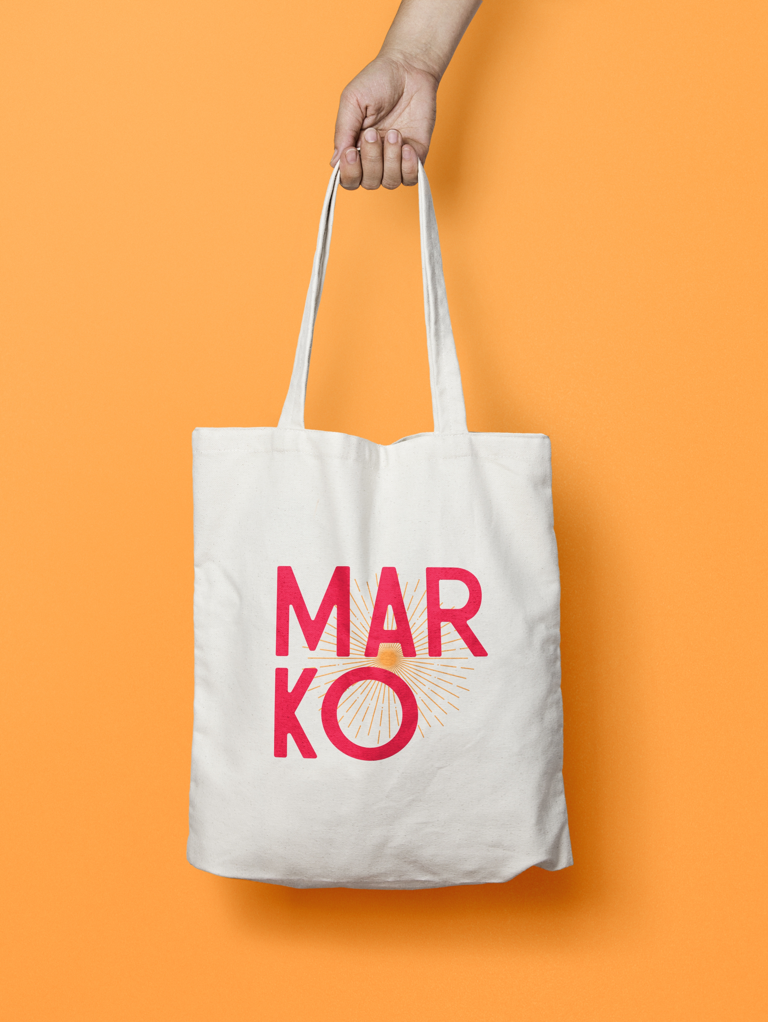
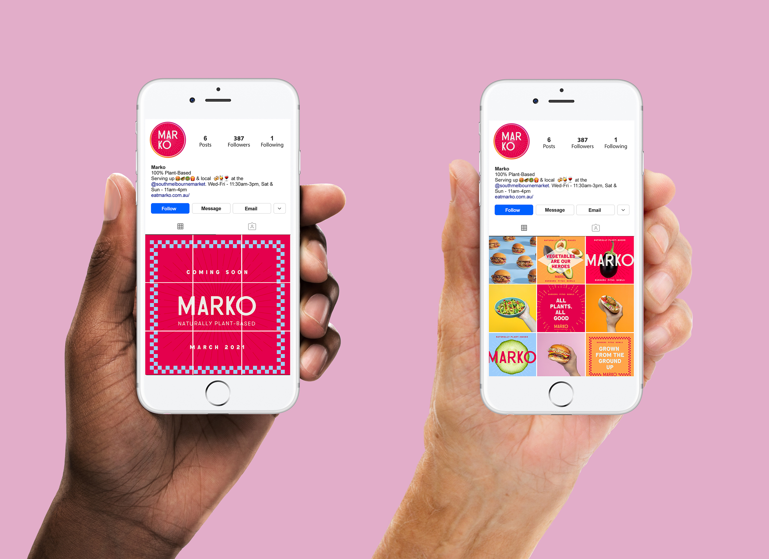
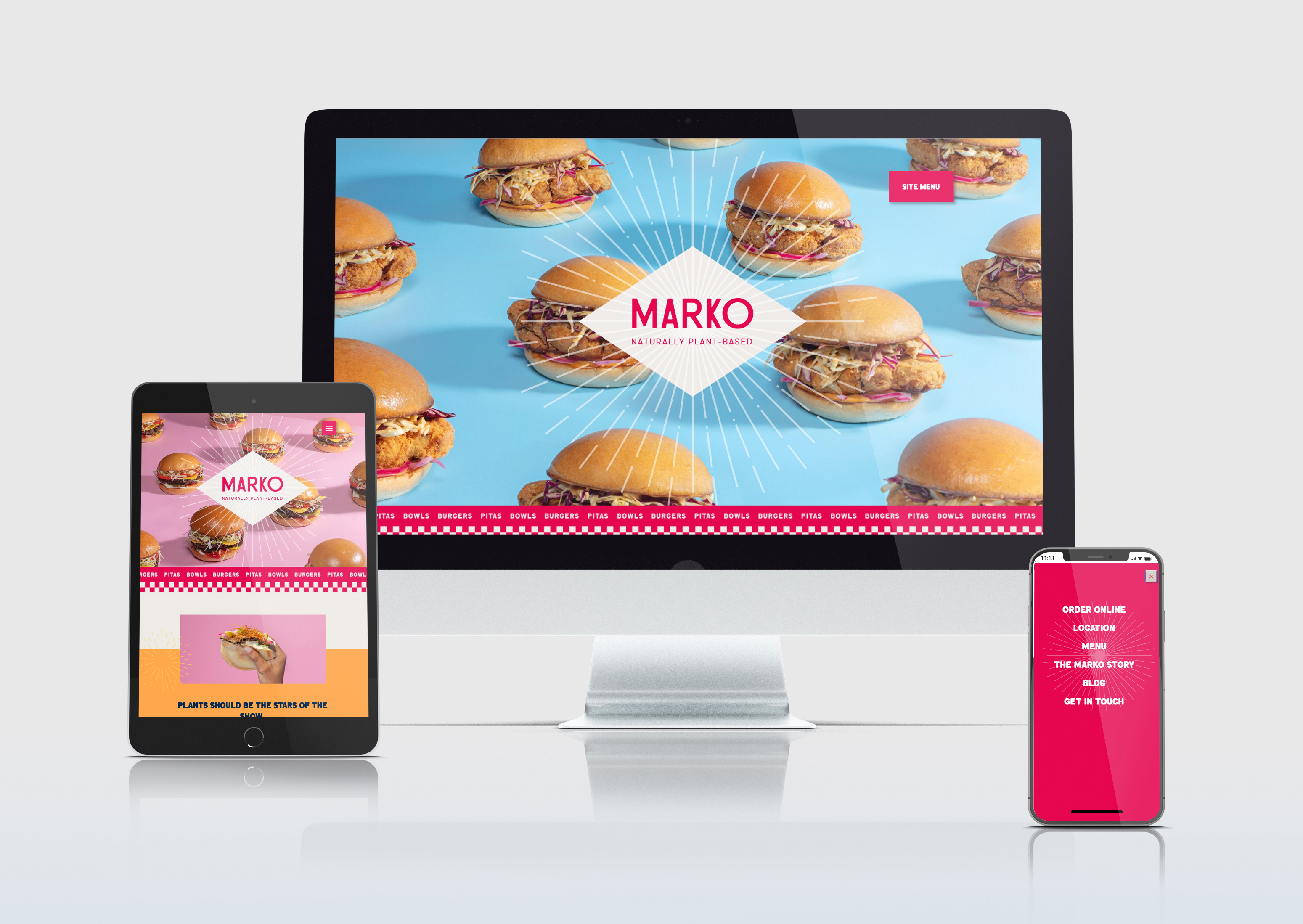
I was the sole designer on this project, taking the client's brief and leading them on a journey through suggested directions, visual concepts, and design development. As with any restaurant, there were multiple visual assets designed, ranging from menus, t-shirts, signage, social tiles, and of course the all-important website. I also created a comprehensive photography styling brief to guide our food stylist and photographer, as well as art directing the hero photography shoot.
The Marko visual identity was inspired by the concept of “Food Nostalgia” — a nod to the days where fresh, locally-grown produce was not a luxury, but a way of life. The Marko logo itself is inspired by vintage type, with its slight imperfections and idiosyncrasies. Vintage motifs such as sunbursts, tablecloth checkers, and lozenge shapes are referenced throughout. We keep things feeling modern with bright pops of colour and a playful sensibility. Bright, primary colours evoke summery, Mediterranean freshness… a region renowned for its fresh food diet.
The Marko “look” is casual and unfussy: it strives to be modern and fun, but also warm and welcoming. We don’t scream “vegan” or try too hard to be cool. We aim to strike a balance between visual consistency and playfulness: the logo is not sacrosanct — we allow its format to be tweaked and experimented with to create fun new variations that are particularly suited for use on merchandise or stickers.


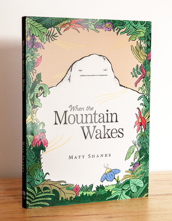
When the Mountain Wakes
Cover design for children's picture book, published by Affirm Press
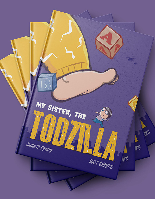
My Sister, the Todzilla
Book design for children's picture book, published by Affirm Press
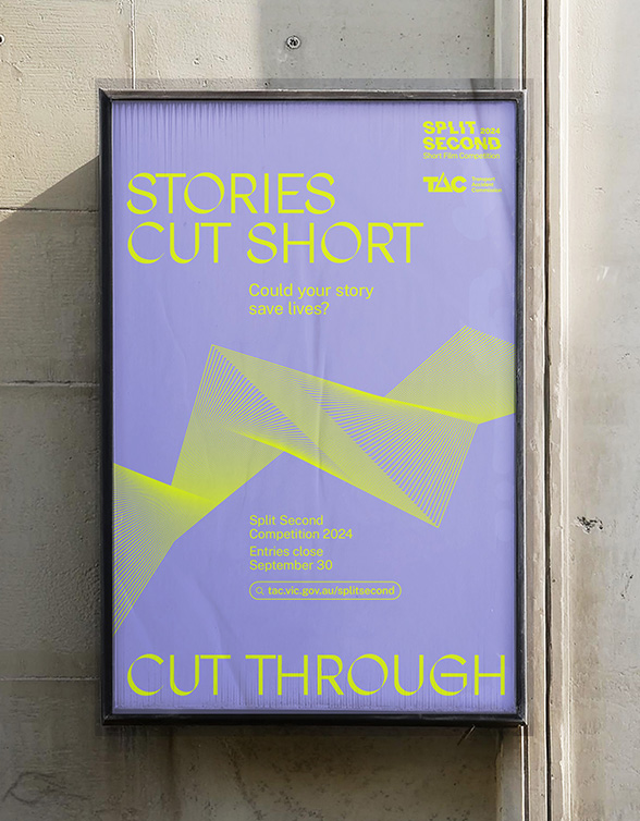
Split Second
Campaign identity concept for TAC
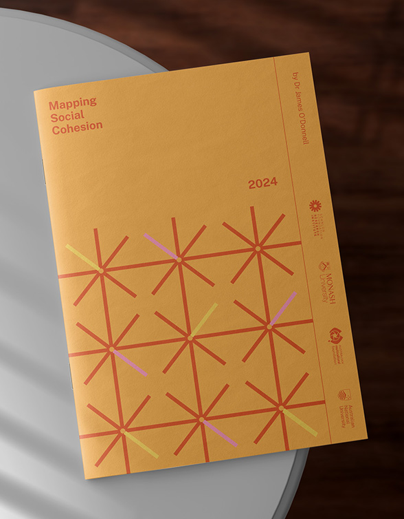
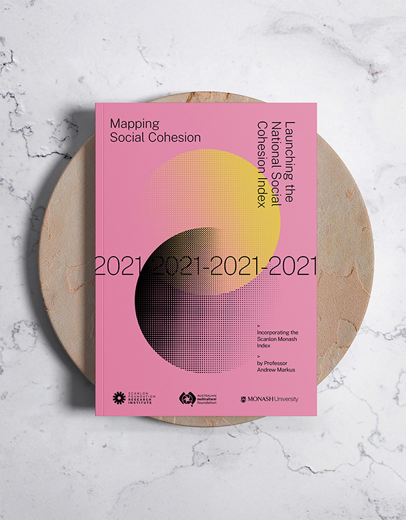
Mapping Social Cohesion 2024
Publication design and visual identity for the Scanlon Foundation Research Institute's annual research report
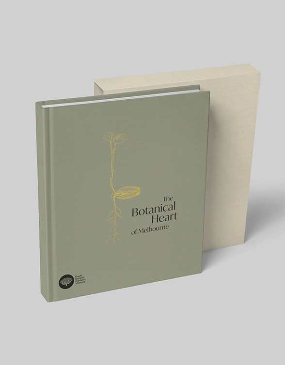
Royal Botanic Gardens
Book design concepts for Melbourne's Royal Botanic Gardens.
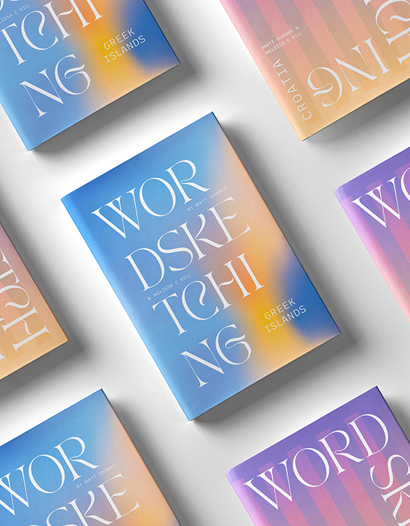
Word Sketching
Book design for my personal travel musings.
Mapping Social Cohesion 2021
Publication design and visual identity for the Scanlon Foundation Research Institute's annual research report
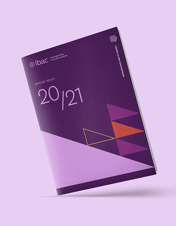
IBAC
Visual identity refresh for Victoria's Independent Broadbased Anti-corruption Commission (IBAC)